MediaWiki:Common.css: Difference between revisions
Darken edit textarea and Codex message boxes |
Add a.gif top banner and b.gif footer banner |
||
| (One intermediate revision by the same user not shown) | |||
| Line 85: | Line 85: | ||
body { | body { | ||
background-color: #000; | background-color: #000; | ||
} | |||
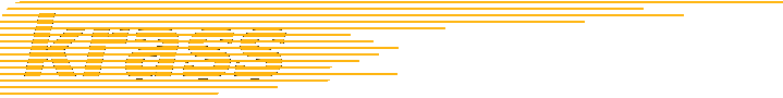
/* Hide the stock MediaWiki logo icon; keep the "Krass" wordmark. */ | |||
.mw-logo-icon { | |||
display: none; | |||
} | |||
/* Original krass banners, injected page-wide via body pseudo-elements | |||
(Common.css can only add CSS, not markup): | |||
- a.gif (719x90) at the very top, before everything, left-aligned | |||
- b.gif (725x30) at the very bottom, below everything, right-aligned */ | |||
body::before { | |||
content: ""; | |||
display: block; | |||
height: 90px; | |||
background: url("/krass-assets/a.gif") no-repeat left top; | |||
} | |||
body::after { | |||
content: ""; | |||
display: block; | |||
height: 30px; | |||
background: url("/krass-assets/b.gif") no-repeat right center; | |||
} | } | ||
Latest revision as of 07:41, 17 June 2026
/* krass.com dark theme for MediaWiki 1.43 — Vector 2022 base.
 *
 * Built by overriding Vector's Codex design tokens (CSS custom properties)
 * rather than fighting per-element cascade — the skin's chrome and content
 * both resolve their colours through these variables, so remapping the
 * palette here re-themes header, sidebar, search, tabs, TOC, tables and
 * content in one place. Loaded as MediaWiki:Common.css.
 *
 * Palette (from the original 2008 krass skin):
 *   background  #000  black
 *   text        #fff  white
 *   links       #ffb210  krass orange  (also the progressive/accent colour)
 *   red links   #dd5500  burnt orange
 */

:root {
  /* --- surfaces --- */
  --background-color-base: #000;
  --background-color-base-fixed: #000;
  --background-color-neutral: #111;
  --background-color-neutral-subtle: #0a0a0a;
  --background-color-interactive: #1a1a1a;
  --background-color-interactive-subtle: #0f0f0f;

  /* --- text --- */
  --color-base: #fff;
  --color-base-fixed: #fff;
  --color-base--hover: #1a1a1a;
  --color-emphasized: #fff;
  --color-subtle: #cccccc;

  /* --- links + progressive accents -> krass orange ---
     The "progressive" token family drives links, the active-tab underline,
     focus rings, selected indicators and primary buttons. Remap the whole
     family off Wikipedia-blue (#36c) onto krass orange. */
  --color-progressive: #ffb210;
  --color-progressive--hover: #ffd060;
  --color-progressive--active: #cc8f0d;
  --color-progressive--focus: #ffb210;
  --color-visited: #ffb210;
  --color-link-red: #dd5500;
  --color-link-red--hover: #ff7722;
  --color-link-red--visited: #dd5500;

  --background-color-progressive: #ffb210;
  --background-color-progressive--hover: #ffc233;
  --background-color-progressive--active: #cc8f0d;
  --background-color-progressive--focus: #ffb210;
  --background-color-progressive-subtle: #2a2009;

  --border-color-progressive: #ffb210;
  --border-color-progressive--hover: #ffd060;
  --border-color-progressive--active: #cc8f0d;
  --border-color-progressive--focus: #ffb210;

  --box-shadow-color-progressive--active: #cc8f0d;
  --box-shadow-color-progressive--focus: #ffd060;
  --box-shadow-color-progressive-selected: #ffb210;
  --box-shadow-color-progressive-selected--hover: #ffd060;
  --box-shadow-color-progressive-selected--active: #cc8f0d;
  --outline-color-progressive--focus: #ffb210;

  --background-color-input-binary--checked: #ffb210;
  --border-color-input-binary--checked: #ffb210;

  /* --- borders --- */
  --border-color-base: #333;
  --border-color-subtle: #2a2a2a;
  --border-color-muted: #1a1a1a;
  --border-color-divider: #333;

  /* --- shadows: the defaults glow white; kill that on a black canvas --- */
  --box-shadow-color-base: #000;
  --box-shadow-color-inverted: #000;

  /* --- quiet-button hover/active are near-invisible dark tints by default;
     make them light translucent so they read on black --- */
  --background-color-button-quiet--hover: rgba(255, 255, 255, 0.07);
  --background-color-button-quiet--active: rgba(255, 255, 255, 0.13);

  /* icons on primary (now-orange) buttons should be dark, not inverted white */
  --filter-invert-primary-button-icon: 0;
}

body {
  background-color: #000;
}

/* Hide the stock MediaWiki logo icon; keep the "Krass" wordmark. */
.mw-logo-icon {
  display: none;
}

/* Original krass banners, injected page-wide via body pseudo-elements
   (Common.css can only add CSS, not markup):
   - a.gif (719x90) at the very top, before everything, left-aligned
   - b.gif (725x30) at the very bottom, below everything, right-aligned */
body::before {
  content: "";
  display: block;
  height: 90px;
  background: url("/krass-assets/a.gif") no-repeat left top;
}
body::after {
  content: "";
  display: block;
  height: 30px;
  background: url("/krass-assets/b.gif") no-repeat right center;
}

/* Primary buttons now have an orange background — their label/icon must be
   dark for contrast (Codex ships them white-on-blue). */
.cdx-button--action-progressive.cdx-button--weight-primary,
.mw-ui-button.mw-ui-progressive,
.oo-ui-flaggedElement-progressive.oo-ui-buttonElement-framed > .oo-ui-buttonElement-button {
  color: #000;
}

/* The edit textarea ships a hardcoded white background (the editfont modules
   set #fff directly rather than reading --background-color-base). */
.mw-editfont-monospace,
.mw-editfont-sans-serif,
.mw-editfont-serif,
textarea#wpTextbox1 {
  background-color: #0a0a0a;
  color: #fff;
}

/* Codex message boxes hardcode a light palette (they're designed to stay
   light); darken the surfaces to match the theme. The coloured left border
   and icon are kept so the message type still reads. */
.cdx-message {
  background-color: #111;
  color: #fff;
}
.cdx-message--warning { background-color: #2a2009; }
.cdx-message--error { background-color: #2a0f0a; }
.cdx-message--success { background-color: #0a201a; }
.cdx-message--notice { background-color: #111; }